As promised here are the pieces from the first ever UNKO Challenge. Each participant was limited to using only the Wacom and reference images if needed. We've decided in an attempt to keep voting honest, no one was allowed to use any distinguishable markings, names, or designer's likenesses in their pieces. (After all you're voting for the image NOT the person that created the image.) Also try to keep the voting based on imagery NOT the person in the image. Leave your vote in the comments section. Click the image if you need a larger view. The winner gets nothing more than bragging rights but what artist doesn't like to brag?! So choose wisely.
*EDIT: If the CAPTCHA is not showing a field to enter anything, click the CAPTCHA image and drag it down or press the "tab" key on your keyboard until you see the entry field*
Entry #1

Entry #2

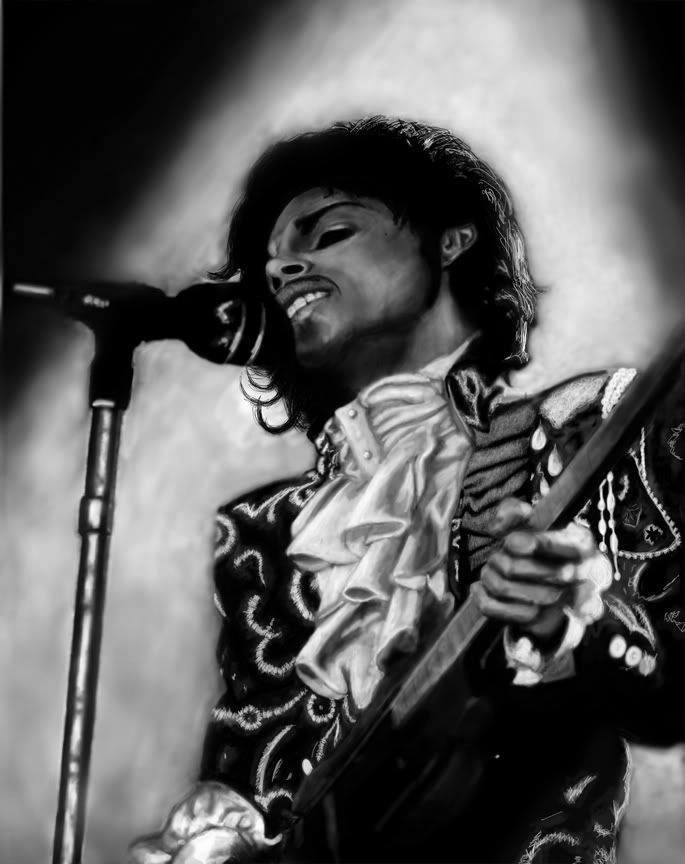
Entry #3
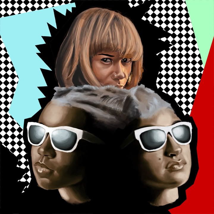
Entry #4


37 Responses to “The UNKO Challenge: Vote Now”
I vote for no. 3. Love the emotion, black and white, and angle.
Dominica
twitter.com/dominicastewart
entry #2
I pick entry #4
that lady looks like me so i vote for entry 2
i love entry #3
entry #3
My vote is for #3.
I vote for entry three.
You gotta love the capture of emomtion on a great musician live on stage. The black and white just adds to what is being displayed on stage. Overall a great depiction by the artist.
#3. An eraser is not supposed to do that.
All of them are nice...but I have to go with Prince; the detail in it is crazy.
#2. for originality & skill. They are all good though, but #2 is my pick
"YOU- I WOULD.DIE FOR. YOU"
ENTRY#3
tough vote tho
-elstacks
Toss up between 1 and 3. Great job to all though. :)
I vote entry #3. Great depth.
numero 3
R.S
number 3
Entry #3 for me...the prince piece is dope
the Prince once is nice BUT the Santigold one looks like an actual painting!! How the heck do you do that digitally?! Plus I like how they did the funky patterns in the background, they're very "Santigold-y" lol so I vote #4
velma, velmshizzle
vote is for number 3. prince yes but the emptiness in the eyes is really what brings out the pic. its raw emotion and a love for music. awesomesauce
#2 for me!
#3 because of the expression, the black and white, and the overall mood
entry #3
I vote for #4.
my vote goes to entry #3 it's incredible
Cool contest aye! I vote #2. Only one that didn't use a celebrity
#3 gets my vote@ very realistic the detail made it. #2 came close
The hair is awesome in number 2, but number 3 gets my vote!
Gotta give it #3. (#2 was extremely close. Like Bush-Gore close!)
entry #2
Entry #4
entry number 1..but love the charcoal as medium look in 3
I'm bout that numba 2!!!
I'm voting #2. Love the modern concept and the hair itself looks great and really time consuming. Great work to everyone though. What a dope contest.
#1
#3
3
I'll Take Door Number 4 Please...
I'm gonna say #3 cuz it looks like the real thing...the shadowing, angle, and the facial expression make it a winner...
#4 is a close second...the colors and expressions in the faces are real! The chick on top loses me though, she doesn't feel like the rest of the piece.
Peace!
Leave a Reply